Dataset
The single-cell RNA sequencing dataset of peripheral blood mononuclear cells (PBMCs) from healthy versus COVID-19 infected donors published by Wilk et al., (2020) will be used to demonstrated how cell cluster probability can be used to identify perturbed cell states and associated differential gene expression programs. In addition to the original cell type annotations, the object provided contains the cell type annotations given by Välikangas et al., 2022.
The original dataset has been downsampled to 21K cells (1.5K cells
per sample; from 44,721 cells) to increase the speed and reduce the
computational resources required to run this vignette. To facilitate the
reproduction of this vignette, the data is distributed through
Zenodo as a SingleCellExperiment object, the
object (class) required by most functions in Coralysis (see
Chapter
4 The SingleCellExperiment class - OSCA manual)
# Install packages
if (! "scater" %in% installed.packages()) pak::pkg_install("scater")
if (! "ComplexHeatmap" %in% installed.packages()) pak::pkg_install("ComplexHeatmap")

# Import packages
library("dplyr")
library("scater")
library("ggplot2")
library("Coralysis")
library("SingleCellExperiment")
# Import data
data.url <- "https://zenodo.org/records/14845751/files/covid_Wilk_et_al.rds?download=1"
sce <- readRDS(file = url(data.url))

# Downsample every sample to 1.5K cells: 21K cells in total
cells.by.donor <- split(x = colnames(sce), f = sce$Donor_full)
ncells <- 1.5e3
set.seed(123)
down.cells <- lapply(X = cells.by.donor, FUN = function(x) {
    sample(x = x, size = ncells, replace = FALSE)
})
down.cells <- unlist(down.cells)
sce <- sce[,down.cells]
Normalization
Coralysis requires log-normalised data as input. The
dataset above has been previously normalised with the basic
log-normalisation method in Seurat. Below is a simple
custom function that can be used to perform Seurat (see NormalizeData).
## Normalize the data
# log1p normalization
SeuratNormalisation <- function(object) {
  # 'SeuratNormalisation()' function applies the basic Seurat normalization to
  #a SingleCellExperiment object with a 'counts' assay. Normalized data
  #is saved in the 'logcounts' assay.
  logcounts(object) <- apply(counts(object), 2, function(x) {
    log1p(x/sum(x)*10000)
  }) # log1p normalization w/ 10K scaling factor
  logcounts(object) <- as(logcounts(object), "sparseMatrix")
  return(object)
}
sce <- SeuratNormalisation(object = sce)
In alternative, scran normalization can be performed,
which is particularly beneficial if rare cell types exist (see the
following vignette).
## scran normalisation
ScranNormalisation <- function(object) {
    norm_clusters <- scran::quickCluster(object)
    object <- scran::computeSumFactors(object, clusters = norm_clusters)
    object <- scater::logNormCounts(object)
    return(object)
}

# Split object by batch: 'Donor_full'
batch.levels <- levels(sce$Donor_full)
names(batch.levels) <- batch.levels
sce.list <- lapply(batch.levels, function(x) sce[,sce$Donor_full == x])

# Apply normalisation
set.seed(123)
sce.list <- lapply(sce.list, ScranNormalisation)

# Join
sce <- do.call(cbind, sce.list)
HVG selection
Highly variable genes (HVG) can be selected using the R package
scran. The variable Donor_full from
colData is used as batch label. The
SingleCellExperiment object allows alternative experiments
to the main experiment. This is important to keep a backup of all genes
in the same SingleCellExperiment object before selecting
HVGs (see SingleCellExperiment
vignette).
# Feature selection with 'scran' package
nhvg <- 2000
batch.label <- "Donor_full"
sce[[batch.label]] <- factor(sce[[batch.label]])
m.hvg <- scran::modelGeneVar(sce, block=sce[[batch.label]])
hvg.ordered <- order(m.hvg[["bio"]], decreasing=TRUE)
top.hvg <- row.names(sce)[hvg.ordered[1:nhvg]]
rowData(sce) <- cbind("highly_variable" = row.names(sce) %in% top.hvg, m.hvg)

# Subset object
sce <- sce[top.hvg,]
DimRed: pre-integration
A PCA and UMAP representation of dataset before performing
integration can be obtained with Coralysis. Several
parameters can be provided to the functions in order to adjust the
analyses to the dataset (see ?Coralysis::RunPCA() and
?Coralysis::RunUMAP).
# Dimensional reduction - unintegrated
set.seed(123)
sce <- RunPCA(object = sce, assay.name = "logcounts", dimred.name = "unintPCA")
set.seed(123)
sce <- RunUMAP(object = sce, dims = 1:30, dimred.type = "unintPCA",
               umap.method = "uwot", dimred.name = "unintUMAP",
               n_neighbors = 15, min_dist = 0.3)
# Plotting
batch.label <- "Donor_full"
original.cell.label <- "cell_type"
cell.label <- "predicted_celltype_l2"
vars2plot <- c(batch.label, original.cell.label, cell.label)
names(vars2plot) <- vars2plot
unint.plts <- lapply(X = vars2plot, FUN = function(x) {
    PlotDimRed(object = sce, color.by = x, dimred = "unintUMAP", point.size = 0.2,
               legend.nrow = 10, point.stroke = 0.1)
}) # plot each variable
all.unint.plts <- cowplot::plot_grid(plotlist = unint.plts, ncol = 3, align = "vh") # join plots together
all.unint.plts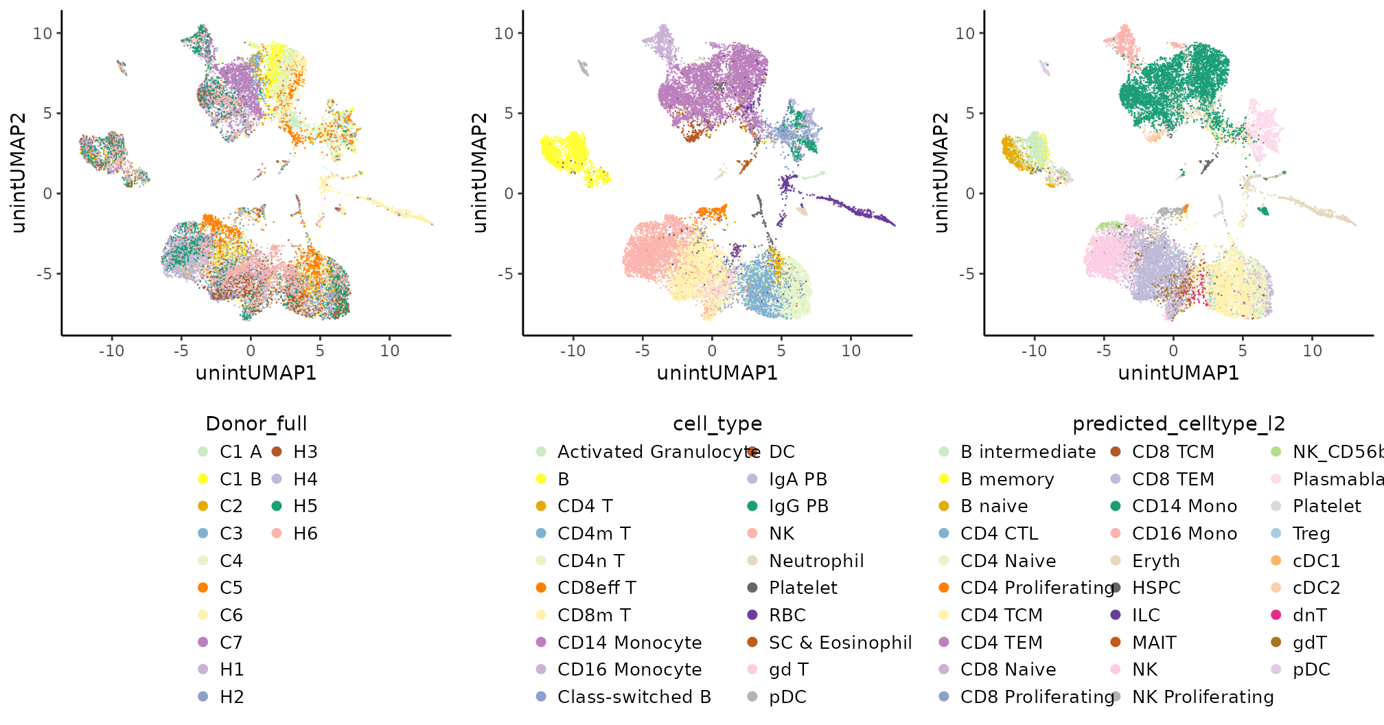
It is clear the donor effect, particularly for some cell types, such as CD14 monocytes and CD8 memory T cells.
Multi-level integration
Multi-level integration can be performed with Coralysis
by running the function RunParallelDivisiveICP(). Only the
batch.label parameter is required. The
batch.label corresponds to a variable in
colData. In this case Donor_full. The
RunParallelDivisiveICP() function can be run in parallel by
providing the number of threads to reduce the run time (it
takes around 25 min. with ICP batch size 1K cells and 4 threads).
Consult the full documentation of this function with
?RunParallelDivisiveICP.
# Perform multi-level integration
set.seed(123)
sce <- RunParallelDivisiveICP(object = sce, batch.label = "Donor_full",
                              icp.batch.size = 1000, threads = 4)
Coralysis returns a list of cell cluster probabilities
saved at metadata(sce)$coralysis$joint.probability of
length equal to the number of icp runs, i.e., L (by default
L=50), times the number of icp rounds, i.e.,
log2(k) (by default k=16, thus 4 rounds of
divisive icp).
ICP clusters
The cell cluster probability for a given icp run through its divisive
rounds can be plotted with the function PlotClusterTree().
A colData variable can be provided to see its composition
per cluster across divisive rounds for the respective icp run. See
examples below for icp run number 16.
## Plot cluster tree for icp run 16
# Probability
prob.cluster.tree <- PlotClusterTree(object = sce, icp.run = 16)

# batch label distribution
batch.cluster.tree <- PlotClusterTree(object = sce, icp.run = 16, color.by = "Donor_full")

# original cell type label distribution
orig.cell.cluster.tree <- PlotClusterTree(object = sce, icp.run = 16, color.by = "cell_type")

# Azimuth/predicted cell type label distribution
cell.cluster.tree <- PlotClusterTree(object = sce, icp.run = 16, color.by = "predicted_celltype_l2")

# Join all plots with 'cowplot'
all.cluster.tree <- cowplot::plot_grid(cowplot::plot_grid(prob.cluster.tree, batch.cluster.tree,
                                                          ncol = 2, rel_widths = c(0.5, 0.5), align = "v"),
                                       cowplot::plot_grid(orig.cell.cluster.tree, cell.cluster.tree,
                                                          ncol = 2, rel_widths = c(0.5, 0.5), align = "vh"),
                                       ncol = 1)
all.cluster.tree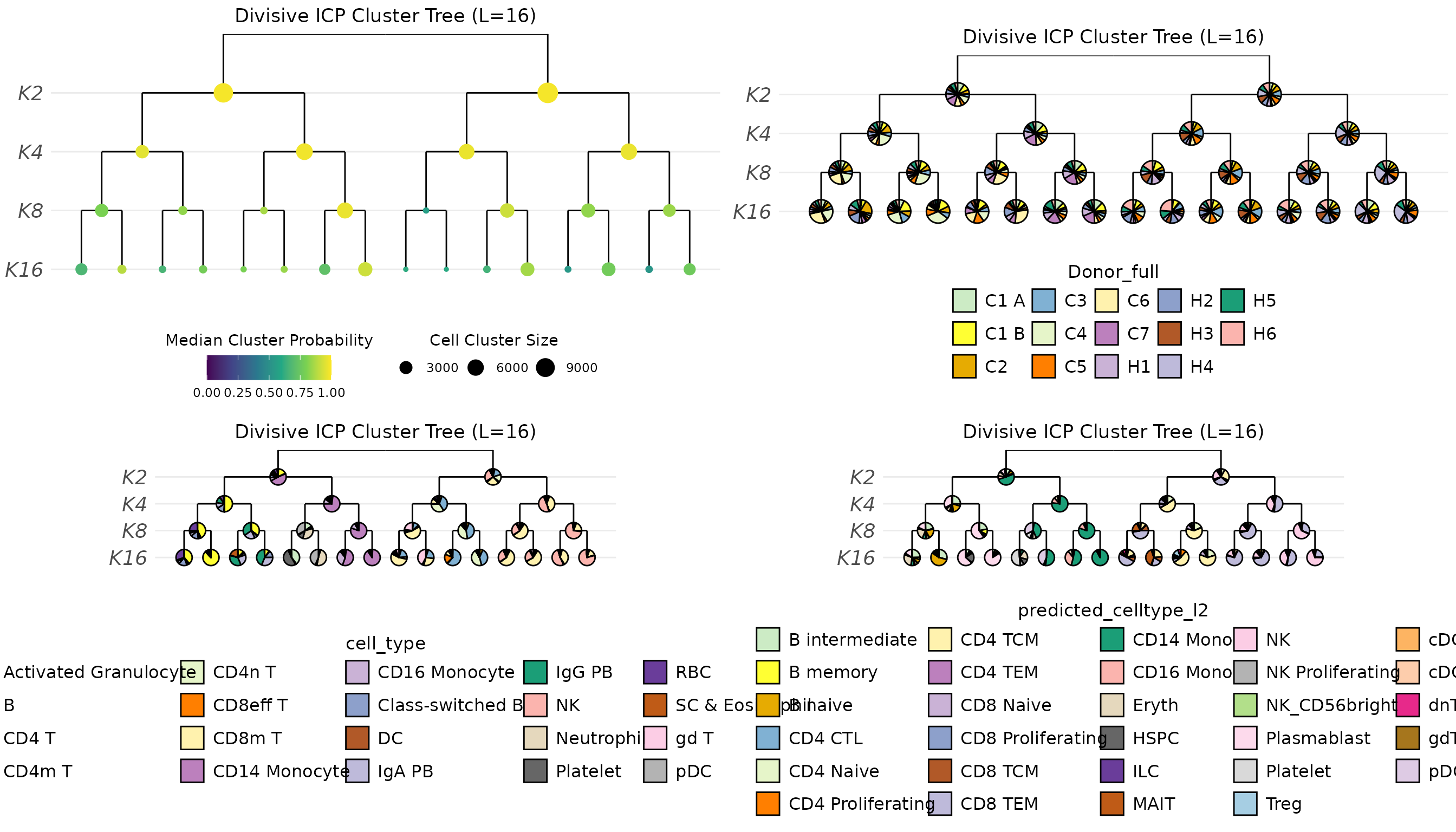
Some cell types formed unique clusters, but quite few remained mixed.
Multi-level integration resolution might get better by running
RunParallelDivisiveICP() with 32 cluster, i.e.,
k = 32, instead 16.
DimRed: after integration
Coralysis returns a list of cell cluster probabilities
saved at metadata(sce)$coralysis$joint.probability of
length equal to the number of icp runs, i.e., L (by default
L=50), times the number of icp rounds, i.e.,
log2(k) (by default k=16, thus 4 rounds of
divisive icp). The cell cluster probability can be concatenated to
compute a PCA in order to obtain an integrated embedded. By default only
the cell cluster probability corresponding to the last icp round is
used. The Coralysis integrated embedding can be used
downstream for non-linear dimensional reduction, t-SNE or UMAP,
and clustering.
# Dimensional reduction - unintegrated
set.seed(123)
sce <- RunPCA(object = sce, assay.name = "joint.probability", dimred.name = "intPCA")

# UMAP
set.seed(123)
sce <- RunUMAP(object = sce, dimred.type = "intPCA",
               umap.method = "uwot", dimred.name = "intUMAP",
               dims = 1:30, n_neighbors = 15, min_dist = 0.3)
# Plotting
int.plts <- lapply(X = vars2plot, FUN = function(x) {
    PlotDimRed(object = sce, color.by = x, dimred = "intUMAP", point.size = 0.2, legend.nrow = 10, point.stroke = 0.1)
}) # plot each variable
all.int.plts <- cowplot::plot_grid(plotlist = int.plts, ncol = 3, align = "vh") # join plots together
all.int.plts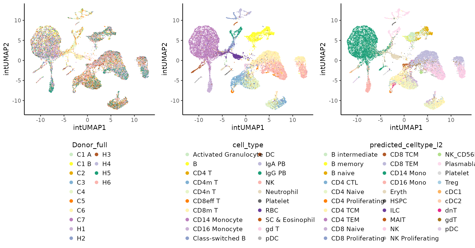
Coralysis efficiently integrated the donor PBMC samples,
identified small populations (e.g., neutrophils, Treg, MAIT, dnT, NK
CD56bright), and differentiation trajectories (e.g., B naive to
memory).
Graph-based clustering
Graph-based clustering can be obtained by running the
scran function clusterCells() using the
Coralysis integrated embedding. In alternative, the joint
cluster probabilities can be used for clustering. The advantages of
using the integrated embedding instead joint probabilities are:
computational efficiency; and, noise robustness. Using the joint
probabilities instead PCA embedding takes considerably more time.
### Graph-based clustering with scran
## Coralysis integrated PCA embedding
reducedDim(sce, "cltPCA") <- reducedDim(sce, "intPCA")[,1:30]
set.seed(1024)
sce$emb_clusters <- scran::clusterCells(sce, use.dimred = "cltPCA",
                                        BLUSPARAM = bluster::SNNGraphParam(k = 15, cluster.fun = "louvain"))

## Coralysis joint cluster probabilities
# retrieve ICP cell cluster probability tables for every icp run, but only for the last divisive round
probs <- GetCellClusterProbability(object = sce, icp.round = 4)
# dim(probs) # 21K cells x 800 clusters (16 clusters x 50 icp runs = 800 clusters)
probs <- t(probs)
colnames(probs) <- colnames(sce)
prob.sce <- SingleCellExperiment(assays = list("probability" = probs))
set.seed(1024)
sce$prob_clusters <- scran::clusterCells(prob.sce,
                                         assay.type = "probability",
                                         BLUSPARAM = bluster::SNNGraphParam(k = 15, cluster.fun = "louvain"))
# Plotting
vars2plot2 <- c(cell.label, "emb_clusters", "prob_clusters")
names(vars2plot2) <- vars2plot2
clts.plts <- lapply(X = vars2plot2, FUN = function(x) {
    PlotDimRed(object = sce, dimred = "intUMAP", color.by = x, point.size = 0.2, legend.nrow = 10, point.stroke = 0.1)
}) # plot each variable
all.clts.plts <- cowplot::plot_grid(plotlist = clts.plts, ncol = 3, align = "vh") # join plots together
all.clts.plts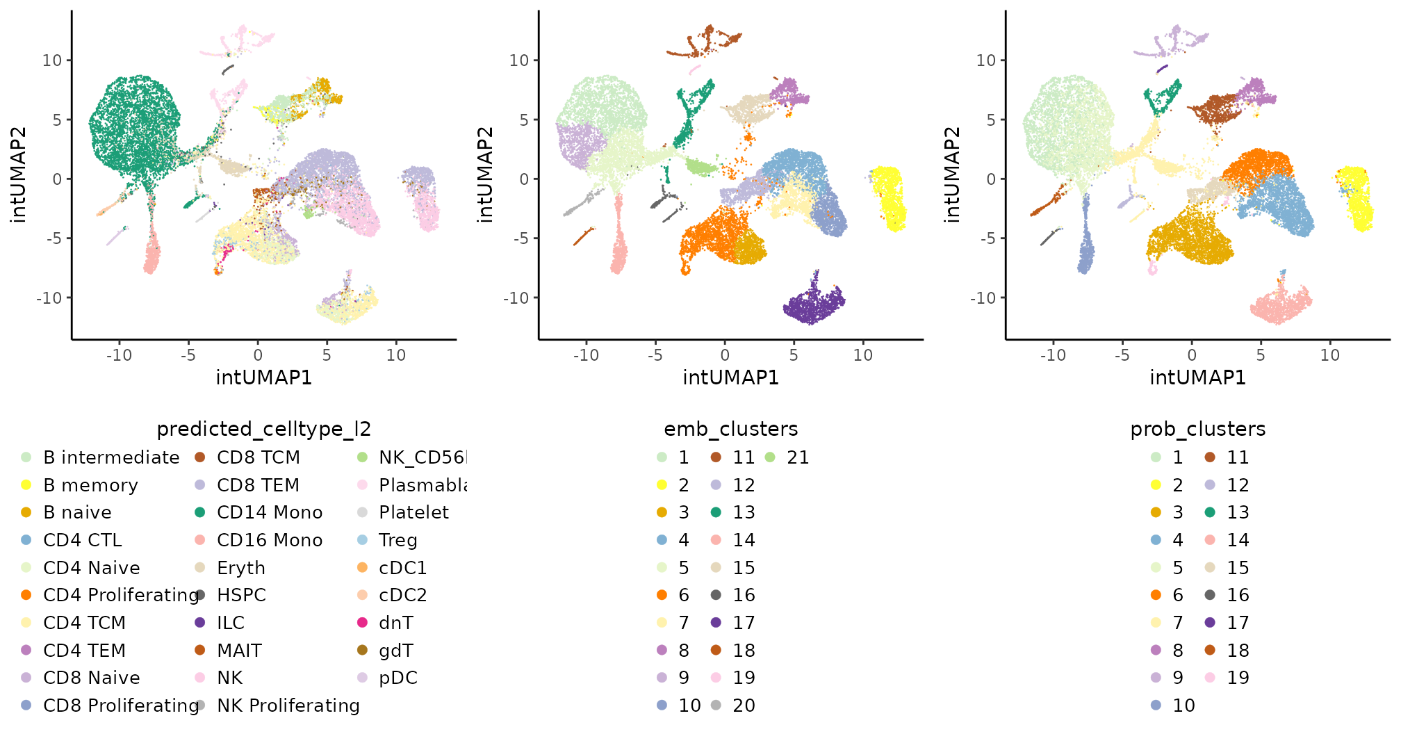
Cell state identification
The cell cluster probability aggregated by mean or median across the
icp runs can be obtained with the function
SummariseCellClusterProbability() and plotted to infer
transient and steady cell states.
# Summarise cell cluster probability
sce <- SummariseCellClusterProbability(object = sce, icp.round = 4) # save result in 'colData'
# colData(sce) # check the colData
# Plot cell cluster probabilities - mean
# possible options: "mean_probs", "median_probs", "scaled_median_probs"
PlotExpression(object = sce, color.by = "scaled_mean_probs", dimred = "intUMAP", color.scale = "viridis",
point.size = 0.2, point.stroke = 0.1, legend.title = "Mean prob.\n(min-max)") 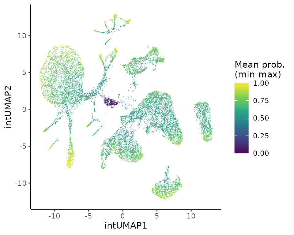
For instance, B cell states (naive, intermediate, memory) are not
well supported by Coralysis cell cluster probability,
probably because it would require to run Coralysis at
higher resolution, i.e., k=32 instead
k=16.
Gene coefficients
Gene coefficients can be obtained for a given cell label through
majority voting with the function MajorityVotingFeatures().
The majority voting is performed by searching for the most
representative cluster for a given cell label across all possible
clusters (i.e., across all icp runs and rounds). The most representative
cluster corresponds to the cluster with the highest majority voting
score. This corresponds to the geometric mean between the proportion of
cells from the given label intersected with a cluster and the proportion
of cells from that same cluster that intersected with the cells from the
given label. The higher the score the better. A cluster that scores 1
indicates that all its cells correspond to the assigned label, and vice
versa; i.e., all the cells with the assigned label belong to this
cluster. For example, MajorityVotingFeatures() by providing
the colData variable "emb_clusters"(i.e.,
label="emb_clusters").
# Get label gene coefficients by majority voting
clts.gene.coeff <- MajorityVotingFeatures(object = sce, label = "emb_clusters")
The function MajorityVotingFeatures() returns a list
with two elements:
feature_coeff: a list of data frames comprising the gene coefficients and respective weights.summary: a data frame summarizing which ICP cluster best represents each cell label, along with the respective majority voting score.
# Print cluster gene coefficients summary
clts.gene.coeff$summary
## label icp_run icp_round cluster score
## 1 1 22 4 8 0.8157863
## 2 2 24 4 16 0.9421878
## 3 3 21 4 11 0.5959206
## 4 4 21 4 14 0.6799433
## 5 5 29 4 7 0.6721712
## 6 6 48 4 11 0.7086803
## 7 7 36 4 14 0.4917519
## 8 8 16 4 2 0.8996775
## 9 9 22 4 7 0.5562097
## 10 10 47 4 16 0.6487200
## 11 11 19 4 4 0.9326988
## 12 12 24 4 9 0.5858352
## 13 13 21 4 2 0.7723912
## 14 14 41 4 6 0.8999670
## 15 15 37 4 3 0.8040199
## 16 16 29 4 10 0.6894886
## 17 17 48 4 12 0.9532055
## 18 18 46 4 5 0.7898323
## 19 19 18 4 10 0.6683786
## 20 20 20 4 7 0.9176726
## 21 21 31 4 1 0.8014923Unique marker: PRSS23
One of the strengths of Coralyis consist of finding
unique cluster markers as it was the case for cluster 2.
# Print top 30 positive gene coefficients for cluster 2: NK + CD8 TEM
head(clts.gene.coeff$feature_coeff$`2`[order(clts.gene.coeff$feature_coeff$`2`[,2], decreasing = TRUE),], 30)
## feature coeff_clt16
## 43 PRSS23 4.3504965756
## 18 GZMB 0.1637480659
## 19 GZMH 0.1308493859
## 79 ZBTB44 0.1109175583
## 40 PATL2 0.0983686833
## 72 TBX21 0.0954275398
## 7 CD247 0.0753691598
## 15 GNLY 0.0730897748
## 61 RUNX3 0.0686593222
## 39 PARP8 0.0654860566
## 42 PRF1 0.0504557585
## 8 CDK6 0.0427174844
## 27 KLRD1 0.0402690820
## 17 GZMA 0.0375472215
## 46 PXN 0.0360506239
## 14 GNG2 0.0223021975
## 25 IPCEF1 0.0156802538
## 45 PTGER4 0.0087374973
## 6 CCL5 0.0082154040
## 47 RBM27 0.0031892948
## 80 ZEB2 0.0018210680
## 69 ST3GAL1 -0.0005403014
## 12 GIMAP4 -0.0008745088
## 68 SMARCA2 -0.0013411496
## 21 HSP90AB1 -0.0020678336
## 75 TMSB4X -0.0027057304
## 51 RPL34 -0.0032341377
## 57 RPS3 -0.0033493263
## 4 BIRC6 -0.0040249087
## 2 ACTB -0.0047227878
# Plot the expression of PRSS23
PlotExpression(sce, color.by = "PRSS23", dimred = "intUMAP", point.size = 0.5, point.stroke = 0.5)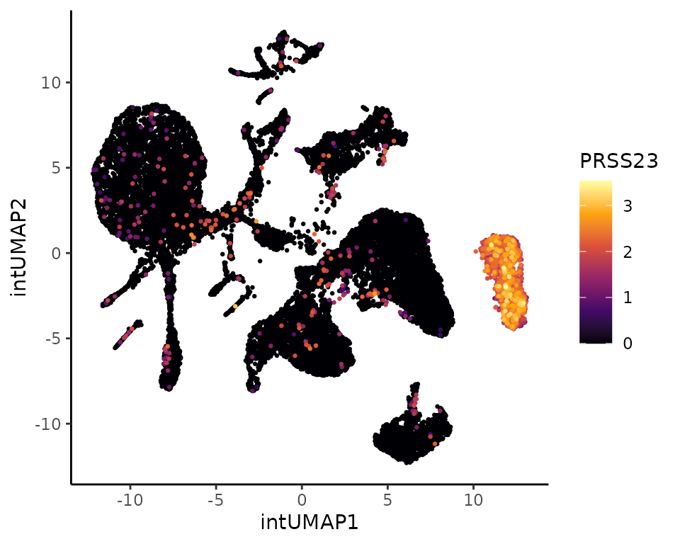
Cluster markers
CD14 Mono: 1 vs 5
Coralysis identified three main clusters of CD14
monocytes: 1 (2,028 cells), 5 (1,651), and 9 (935) (considering the
Louvain clustering obtained with the integrated embedding). The clusters
1 was compared against 5 below.
# Cluster gene coefficients: 1 versus 8
clt1 <- clts.gene.coeff$feature_coeff$`1`
clt1 <- clt1[order(clt1[,2], decreasing = TRUE),]
clt5 <- clts.gene.coeff$feature_coeff$`5`
clt5 <- clt5[order(clt5[,2], decreasing = TRUE),]

# Merge cluster coefficients
clt1vs5 <- merge(clt1, clt5, all = TRUE)
clt1vs5[is.na(clt1vs5)] <- 0
clt1vs5.parsed <- clt1vs5 %>%
    mutate("coeff_variation" = abs(coeff_clt7 - coeff_clt8)) %>%
    arrange(desc(coeff_variation)) %>%
    filter(coeff_clt7!=0 & coeff_clt8!=0) %>%
    filter((coeff_clt7 * coeff_clt8)<0)
top5.clt1 <- clt1vs5.parsed  %>%
    arrange(desc(coeff_clt8)) %>%
    pull(feature) %>% head(5)
top5.clt5 <- clt1vs5.parsed %>%
    arrange(desc(coeff_clt7)) %>%
    pull(feature) %>% head(5)

# Top 5 positive coefficients in each cluster
top5.genes <- c(top5.clt1, top5.clt5)
names(top5.genes) <- top5.genes

# Plot
top5.gexp.mono.clts.plts <- lapply(X = top5.genes, FUN = function(x) {
    PlotExpression(object = sce, color.by = x, dimred = "intUMAP",
                   scale.values = TRUE, point.size = 0.25, point.stroke = 0.25)
})
all.top5.gexp.mono.clts.plts <- cowplot::plot_grid(plotlist = top5.gexp.mono.clts.plts, ncol = 5, align = "vh")
all.top5.gexp.mono.clts.plts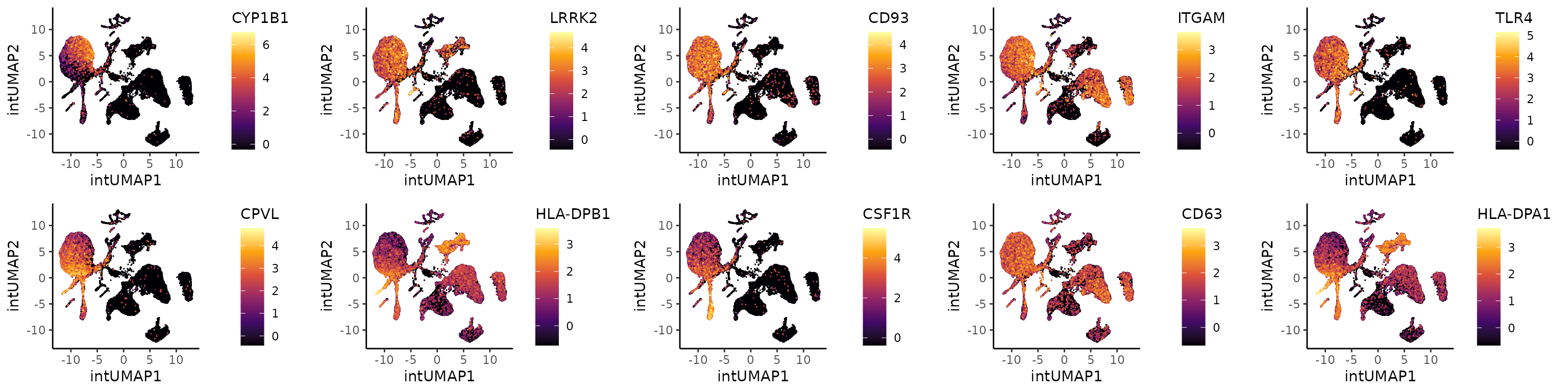
The expression level of CYP1B1 in cluster 1 is slightly higher in COVID-19 infected donor cells than healthy donors, particularly, for ventilated versus healthy donors.
scater::plotExpression(object = sce[,sce$emb_clusters=="1"], features = "CYP1B1",
                       color_by = "Ventilated", x = "Ventilated")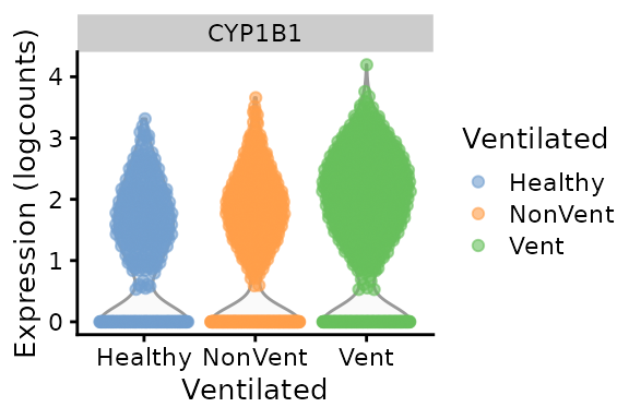
The previous plots suggest that clusters 1 and 5 are phenotypically different. In addition, low expression of HLA-DR (HLA-DRA, HLA-DRB1) genes has been associated with severe inflammatory conditions like COVID-19 (see plots below) as well as high expression of S100A9. These results suggest that cluster 1 corresponds to strongly activated or possibly dysregulated monocytes, which are more common in severe COVID-19 than in cluster 5. Indeed, 40% the cells in cluster 1 are from COVID-19 infected donors that required ventilation, whereas this percentage was around to 25% for cluster 5.
genes2plot <- c("HLA-DRA", "HLA-DRB1")
gexp.hla.plots <- lapply(genes2plot, function(x) {
    PlotExpression(object = sce, color.by = x, dimred = "intUMAP",
                   scale.values = TRUE, point.size = 0.25, point.stroke = 0.25)
})
cowplot::plot_grid(plotlist = gexp.hla.plots, ncol = 2, align = "vh")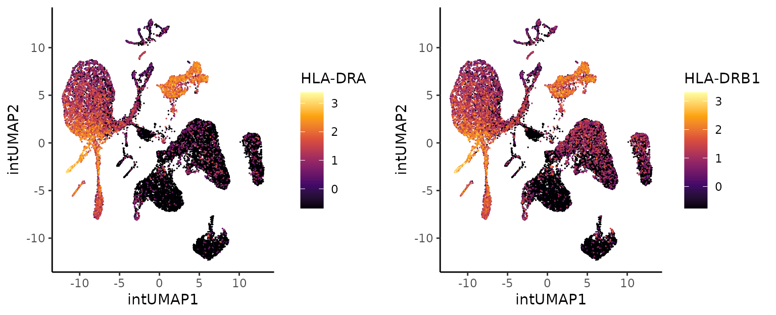
Perturbed cell states
CD16 Monocytes
The cell cluster probability can be used to search for altered cell
states, e.g., associated with COVID-19. The distribution of cell cluster
probability per cluster (integrated embedding) per
ventilated group is shown below after running the function
CellClusterProbabilityDistribution(). Cluster 14, roughly
corresponding to CD16 monocytes, shows a difference between healthy and
COVID associated cells (non-ventilated and ventilated donor cells).
## Disease associated cell state
# Search for diseased affected cell states
prob.dist <- CellClusterProbabilityDistribution(object = sce,
                                                label = "emb_clusters",
                                                group = "Ventilated",
                                                probability = "scaled_mean_probs")
prob.dist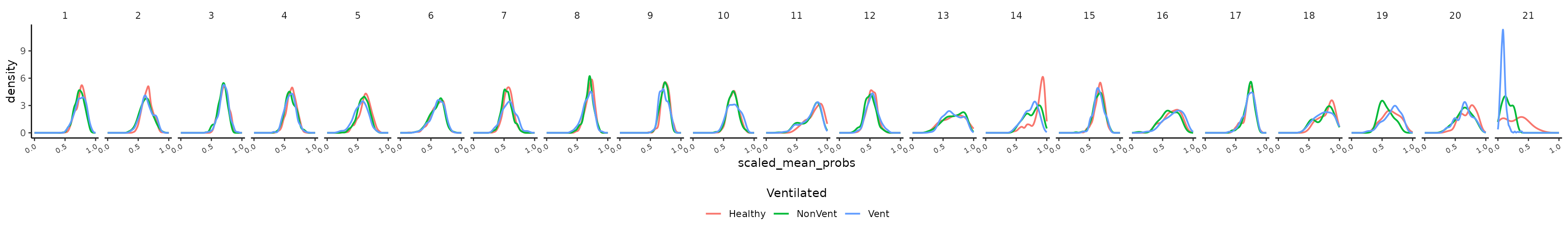
Cell cluster probability bins per cluster label can be
obtained by running BinCellClusterProbability(), which
returns a SingleCellExperiment object with
logcounts average per label per cell
probability bin. The number of probability bins can be provided to the
parameter bins. The cell frequency per cell bin per group
of interest can be obtained with the function
TabulateCellBinsByGroup(). The heatmap below shows the cell
frequency across ventilated groups per bins for cluster 14
(corresponding to CD16 monocytes). The cell frequency represented below
corresponds to the cell proportions per group (healthy, non-ventilated
and ventilated) scaled by bins, i.e., columns. Cell states with higher
probabilities tend to be more “healthier” than states with lower
probabilities.
# cell states SCE object
cellstate.sce <- BinCellClusterProbability(object = sce, label = "emb_clusters", icp.round = 4, bins = 20)

# Tabulate cell bins by group
cellbins.tables <- TabulateCellBinsByGroup(object = cellstate.sce, group = "Ventilated", relative = TRUE, margin = 1)

# Heatmap of cell bins distribution by group for cluster 20 - CD16 Monocytes
cluster <- "14"
col.fun <- circlize::colorRamp2(c(-1.5, 0, 1.5), viridis::inferno(3))
heat.plot <- ComplexHeatmap::Heatmap(matrix = scale(cellbins.tables[[cluster]]),
                                     name = "Col. Z-score",
                                     cluster_rows = FALSE,
                                     cluster_columns = FALSE,
                                     row_names_side = "left",
                                     col = col.fun,
                                     column_title = "Distribution of cells per cell cluster probability bin",
                                     heatmap_legend_param = list(legend_direction = "horizontal",
                                                                 title_position = "topcenter"))
ComplexHeatmap::draw(heat.plot, heatmap_legend_side = "bottom", annotation_legend_side = "bottom")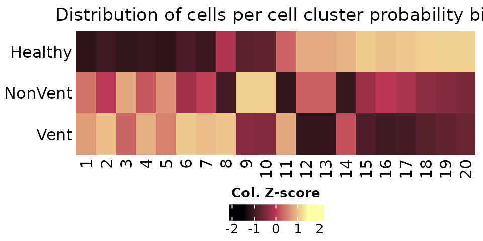
The correlation between cell cluster probability bins from cluster 18
and averaged gene expression can be obtained with the function
CellBinsFeatureCorrelation(). Among the several positively
and negatively correlated genes, the expression of C1QB seems to be
enriched in diseased cells, with a negative Pearson coefficient close to
0.7. This gene was selected as an example due to its expression being
relatively limited to cluster 14.
# Pearson correlated features with cluster 24
cor.features.clt14 <- CellBinsFeatureCorrelation(object = cellstate.sce, labels = cluster)
cor.features.clt14 <- cor.features.clt14 %>%
    filter(!is.na(`14`)) %>%
    arrange(`14`) # C1QB
exp.C1QB.umap <- PlotExpression(sce, color.by = "C1QB", dimred = "intUMAP",
                                scale.values = TRUE, point.size = 0.75, point.stroke = 0.25)
exp.C1QB.violin <- scater::plotExpression(sce[,sce$emb_clusters == cluster], features = "C1QB",
                                          x = "Ventilated", color_by = "Ventilated")
exp.C1QB.umap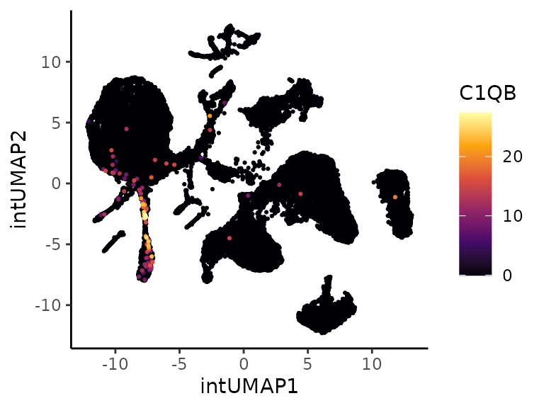
exp.C1QB.violin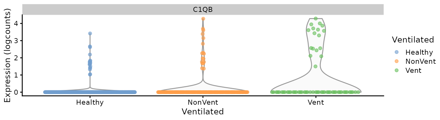
R session
# R session
sessionInfo()
## R version 4.4.2 (2024-10-31)
## Platform: x86_64-pc-linux-gnu
## Running under: Ubuntu 24.04.1 LTS
##
## Matrix products: default
## BLAS: /usr/lib/x86_64-linux-gnu/openblas-pthread/libblas.so.3
## LAPACK: /usr/lib/x86_64-linux-gnu/openblas-pthread/libopenblasp-r0.3.26.so; LAPACK version 3.12.0
##
## locale:
## [1] LC_CTYPE=C.UTF-8 LC_NUMERIC=C LC_TIME=C.UTF-8
## [4] LC_COLLATE=C.UTF-8 LC_MONETARY=C.UTF-8 LC_MESSAGES=C.UTF-8
## [7] LC_PAPER=C.UTF-8 LC_NAME=C LC_ADDRESS=C
## [10] LC_TELEPHONE=C LC_MEASUREMENT=C.UTF-8 LC_IDENTIFICATION=C
##
## time zone: UTC
## tzcode source: system (glibc)
##
## attached base packages:
## [1] stats4 stats graphics grDevices utils datasets methods
## [8] base
##
## other attached packages:
## [1] Coralysis_1.0.0 scater_1.34.0
## [3] ggplot2_3.5.1 scuttle_1.16.0
## [5] SingleCellExperiment_1.28.1 SummarizedExperiment_1.36.0
## [7] Biobase_2.66.0 GenomicRanges_1.58.0
## [9] GenomeInfoDb_1.42.3 IRanges_2.40.1
## [11] S4Vectors_0.44.0 BiocGenerics_0.52.0
## [13] MatrixGenerics_1.18.1 matrixStats_1.5.0
## [15] dplyr_1.1.4
##
## loaded via a namespace (and not attached):
## [1] RColorBrewer_1.1-3 shape_1.4.6.1 jsonlite_1.8.9
## [4] magrittr_2.0.3 modeltools_0.2-23 ggbeeswarm_0.7.2
## [7] farver_2.1.2 rmarkdown_2.29 GlobalOptions_0.1.2
## [10] fs_1.6.5 zlibbioc_1.52.0 ragg_1.3.3
## [13] vctrs_0.6.5 Cairo_1.6-2 htmltools_0.5.8.1
## [16] S4Arrays_1.6.0 BiocNeighbors_2.0.1 SparseArray_1.6.1
## [19] sass_0.4.9 bslib_0.9.0 desc_1.4.3
## [22] plyr_1.8.9 cachem_1.1.0 igraph_2.1.4
## [25] lifecycle_1.0.4 iterators_1.0.14 pkgconfig_2.0.3
## [28] rsvd_1.0.5 Matrix_1.7-1 R6_2.6.0
## [31] fastmap_1.2.0 clue_0.3-66 GenomeInfoDbData_1.2.13
## [34] aricode_1.0.3 digest_0.6.37 colorspace_2.1-1
## [37] dqrng_0.4.1 RSpectra_0.16-2 irlba_2.3.5.1
## [40] textshaping_1.0.0 beachmat_2.22.0 labeling_0.4.3
## [43] httr_1.4.7 polyclip_1.10-7 abind_1.4-8
## [46] compiler_4.4.2 rngtools_1.5.2 doParallel_1.0.17
## [49] withr_3.0.2 BiocParallel_1.40.0 viridis_0.6.5
## [52] ggforce_0.4.2 LiblineaR_2.10-24 MASS_7.3-61
## [55] DelayedArray_0.32.0 rjson_0.2.23 bluster_1.16.0
## [58] tools_4.4.2 vipor_0.4.7 beeswarm_0.4.0
## [61] scatterpie_0.2.4 flexclust_1.4-2 glue_1.8.0
## [64] grid_4.4.2 cluster_2.1.6 reshape2_1.4.4
## [67] generics_0.1.3 snow_0.4-4 gtable_0.3.6
## [70] class_7.3-22 tidyr_1.3.1 BiocSingular_1.22.0
## [73] ScaledMatrix_1.14.0 metapod_1.14.0 XVector_0.46.0
## [76] ggrepel_0.9.6 RANN_2.6.2 foreach_1.5.2
## [79] pillar_1.10.1 stringr_1.5.1 yulab.utils_0.2.0
## [82] limma_3.62.2 circlize_0.4.16 tweenr_2.0.3
## [85] lattice_0.22-6 SparseM_1.84-2 tidyselect_1.2.1
## [88] ComplexHeatmap_2.22.0 locfit_1.5-9.11 knitr_1.49
## [91] gridExtra_2.3 edgeR_4.4.2 xfun_0.50
## [94] statmod_1.5.0 pheatmap_1.0.12 stringi_1.8.4
## [97] UCSC.utils_1.2.0 ggfun_0.1.8 yaml_2.3.10
## [100] evaluate_1.0.3 codetools_0.2-20 tibble_3.2.1
## [103] cli_3.6.4 systemfonts_1.2.1 munsell_0.5.1
## [106] jquerylib_0.1.4 Rcpp_1.0.14 doSNOW_1.0.20
## [109] png_0.1-8 ggrastr_1.0.2 parallel_4.4.2
## [112] pkgdown_2.1.1 doRNG_1.8.6.1 scran_1.34.0
## [115] sparseMatrixStats_1.18.0 viridisLite_0.4.2 scales_1.3.0
## [118] purrr_1.0.4 crayon_1.5.3 GetoptLong_1.0.5
## [121] rlang_1.1.5 cowplot_1.1.3References
Amezquita R, Lun A, Becht E, Carey V, Carpp L, Geistlinger L, Marini F, Rue-Albrecht K, Risso D, Soneson C, Waldron L, Pages H, Smith M, Huber W, Morgan M, Gottardo R, Hicks S (2020). “Orchestrating single-cell analysis with Bioconductor.” Nature Methods, 17, 137-145. https://www.nature.com/articles/s41592-019-0654-x.
Gu, Z. (2022) “Complex heatmap visualization.” iMeta. 1(3):e43. doi: 10.1002/imt2.43.
Lun ATL, McCarthy DJ, Marioni JC (2016). “A step-by-step workflow for low-level analysis of single-cell RNA-seq data with Bioconductor.” F1000Res., 5, 2122. doi:10.12688/f1000research.9501.2.
McCarthy DJ, Campbell KR, Lun ATL, Willis QF (2017). “Scater: pre-processing, quality control, normalisation and visualisation of single-cell RNA-seq data in R.” Bioinformatics, 33, 1179-1186. doi:10.1093/bioinformatics/btw777.
Sousa A, Smolander J, Junttila S, Elo L (2025). “Coralysis enables sensitive identification of imbalanced cell types and states in single-cell data via multi-level integration.” bioRxiv. doi:10.1101/2025.02.07.637023
Wickham H (2016). “ggplot2: Elegant Graphics for Data Analysis.” Springer-Verlag New York.